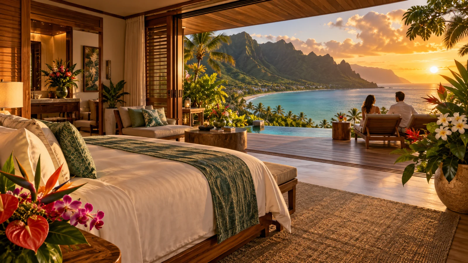
A guest considering a small property in Hawaiʻi is trying to picture a stay, not simply select a room from a list. Where will morning happen? How private is the lanai? Which airport makes sense? What will the booking screen ask next? The website has to make the experience desirable and the decision understandable, without pretending those are separate jobs.
Direct booking begins with that relationship. A beautiful first impression cannot compensate for missing room information, and an efficient reservation button cannot explain why a place is worth choosing. The useful question is what your own website needs to do before, during, and after its handoff to the booking provider.
Establish the property’s identity quickly
Show the real setting, architecture, and character of the stay. A guest should understand whether they are looking at a small hotel, an individual vacation rental, or a collection of homes. Name the island and give enough location context to orient someone unfamiliar with it. Avoid using a dramatic photograph that belongs to a different place or implies access the property does not offer. A specific welcome has more substance than a broad promise of paradise. Let the opening image and a short introduction explain what kind of stay is being offered.
Make room differences easy to compare
Describe the distinctions a guest actually needs: beds, occupancy, outlook, outdoor space, and relevant amenities. Keep the format consistent across categories so visitors do not have to reconstruct a comparison from separate galleries. For a vacation rental, help them understand how the bedrooms and shared spaces relate. Use verified plans or explanatory captions where available. An expressive room name can remain, but it should sit beside plain information. Do not let a large photograph stand in for a fact the guest needs to choose confidently.
Show the stay beyond the bedroom
The lanai, dining setting, approach, and relationship to the coastline may be central to the experience. Give each a distinct role in the image sequence. A guest planning from the mainland or Japan may need to understand which facilities belong to the property and which are nearby. Explain those boundaries rather than relying on implication. If a beach, restaurant, or activity is separately operated, make that clear. Use the property team’s approved information and maintain it as arrangements change. Beautiful context should make the stay more legible, not more ambiguous.
Keep availability and policy in the right system
Decide which platform owns live availability, rates, and reservations. The editorial website should not contradict that source or suggest that an inquiry holds a room. Place clear links to current booking terms where they help the decision. When a booking provider controls cancellation or payment details, test that the visitor can find them before committing. Avoid copying volatile information into several places unless someone is responsible for maintaining every version. A coherent system is easier for guests to understand and easier for a small property team to keep accurate.
Test the handoff with a real task
Choose a room, enter dates if the website supports them, and follow the availability link on a phone. Observe which choices survive the transition. Does the provider open to the correct property? Is the room still selected? Are dates repeated? Some behaviors depend on supported integration features, so confirm them before promising a seamless connection. If an unavoidable change of context remains, explain it with a clear label. Your website can take responsibility for an understandable journey even when the reservation platform is operated elsewhere.
Anticipate arrival questions
Create a concise practical welcome with approved information about check-in, access, transport arrangements, and who answers questions. Be clear about the island and any relevant local time references. Visitors planning across time zones should not have to guess which local time an arrival instruction refers to; a clear label can remove that uncertainty without a complicated converter. Keep operational instructions current and avoid publishing sensitive access codes. Detailed private arrival instructions may belong in a confirmed booking message rather than on a public page.
Make confidence possible without invented proof
Use genuine, permitted photography and accurate descriptions. Publish reviews only when you have the right to use them and can preserve their meaning. Distinguish illustrative images from photographs of the actual accommodation. Do not invent a guest story or claim a booking improvement that has not been measured. If you have limited material, concentrate on clear room facts, useful imagery, and a reliable contact route. A small property can feel thoughtfully presented without pretending to have the scale, facilities, or operating history of a much larger resort.
Keep the page comfortable on a phone
Prepare responsive images, avoid unnecessary autoplay media, and keep the availability action easy to find. Check menus, galleries, room comparisons, and policy links with a thumb, then with a keyboard. Respect reduced-motion preferences and make sure important information remains available when animation is absent. A guest may be comparing properties while traveling or using a modest connection. The first useful content should not wait behind decorative downloads. Performance and clarity belong in the photographic brief as much as in the technical build.
Measure steps without confusing them with bookings
A click toward availability is not a confirmed reservation. If you choose to measure the journey, define each step and understand what the booking provider can actually report. Do not infer revenue from button clicks alone. Review the questions your team receives as another source of useful evidence: repeated uncertainty about room differences or arrival arrangements may point to missing content. Our hotel website design approach connects these practical needs with the property story. The Hawaiʻi web design hub explains the wider design foundation.
Give the place a useful digital welcome
Calyra Bay, An Evermore Original, is an original hospitality design demonstration, not an operating hotel or a report of booking results. Explore its structure and consider what your own guests need before choosing a stay. Then contact Evermore with your website, accommodation type, and current reservation system. The aim is a website that expresses the property with care and makes the route toward a real reservation understandable, while keeping availability, payments, and promises with the people and systems responsible for them.
Tell us about your place.