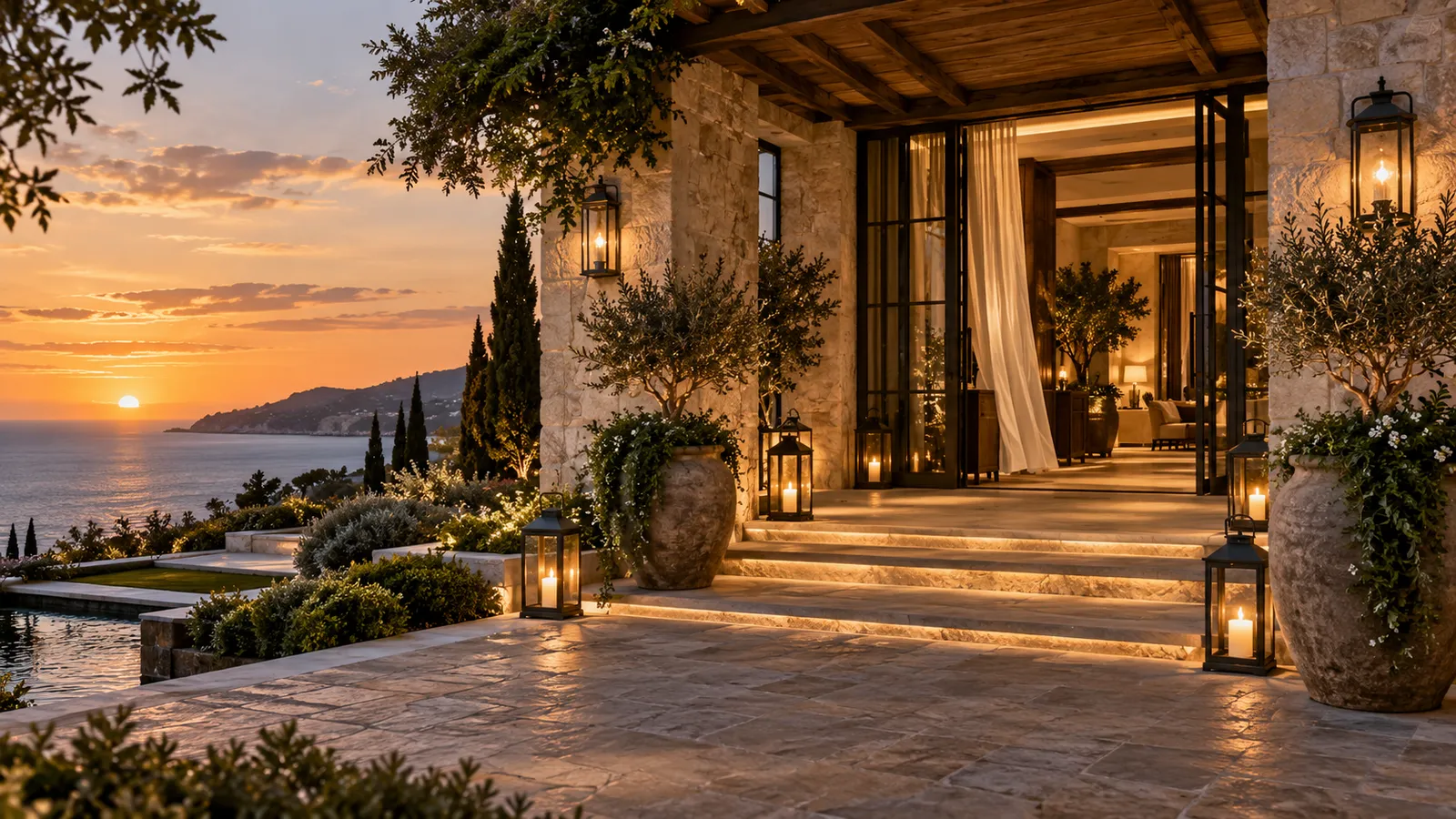
The best hospitality experiences understand arrival.
A guest doesn't simply enter a building. There's an approach, a first view, a threshold, and then a change in light, sound, temperature, or pace that tells the nervous system: you are somewhere else now. Anyone who has stepped off a long flight into warm, plumeria-scented air knows the feeling before they can name it.
The strongest hospitality websites create a digital version of that moment. Not by pretending a screen is a hotel, but by understanding that a website has an arrival sequence too.
Most websites begin with information
Name, tagline, navigation, "Book now." That structure is efficient, but efficiency rarely creates memory.
Hospitality is unusually emotional because guests are buying more than a room. They may be buying rest, celebration, romance, escape, privacy, or time with people they love. The website should understand what kind of transition the guest is hoping to make, and the design should begin there.
Arrival is about orientation
A good opening doesn't have to be dramatic. It has to be specific. Within a few moments, the visitor should start to understand where they are, what kind of experience this is, why it's different, and what emotional territory the brand occupies.
That can happen through a photograph, a single line of copy, a quiet piece of motion, an unusual crop, or a strong typographic decision. Usually it's the relationship between those things that creates the effect. The goal isn't to impress anyone with design. It's to help them enter the world of the business.
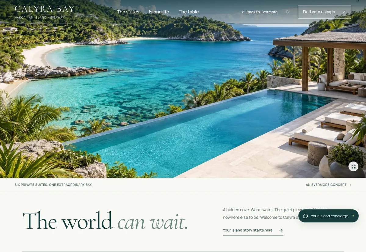
Pace matters
Hospitality brands talk about slowing down while their websites behave like airports. Pop-ups, promotional bars, sticky booking widgets, chat bubbles, newsletter overlays, cookie notices, and five calls to action on the first screen. Each may have a legitimate business reason. Together, they can destroy the very feeling the property is selling.
A luxury experience isn't created by removing all commercial intent. It's created by deciding what deserves attention first.
If the brand promises quiet, the interface shouldn't shout.
If the property promises intimacy, the site shouldn't behave like a marketplace.
If the destination promises discovery, give people room to explore.
The sequence should mirror the guest's questions
A strong hospitality page tends to answer questions in roughly this emotional order: What is this place? Why should I care? What would it feel like to stay here? Which experience is right for me? Can I trust it? What do I need to know? How do I book?
Many websites reverse it, leading with room categories, policies, and booking controls before the visitor has any reason to value them. That's like handing someone the room-service menu before they've walked through the door.
Movement should have a purpose
Hospitality websites suit motion because places aren't static. Water moves, curtains move, fire moves, trees move, light changes through the day. A thoughtful transition can make the digital experience feel more dimensional.
But motion becomes cheap the moment every block slides, fades, or floats simply because the technology allows it. Good motion guides attention: it reveals an image as the story changes, slows the move between two atmospheres, or creates continuity between choosing a room and booking it. The guest should feel the effect before they notice the technique.
Mobile needs an arrival too
The temptation is to reserve the beautiful experience for desktop. That's backwards. A guest may meet the property for the first time on their phone, after a reel, comparing options in bed at midnight. Their phone is the front door. The first image, the crop, the line breaks, the loading speed, and where the first meaningful action sits all matter.
A hospitality website is not a brochure
A brochure presents. An experience progresses.
A brochure says: here are our rooms. An experience says: here's what waking up here might feel like. A brochure says: here are our amenities. An experience says: here's how your day could unfold. A brochure says: book now. An experience says: you understand the place, you know what suits you, and when you're ready, here's the next step.
The Evermore view
We believe a hospitality website should feel like arriving. Not because websites need theatrical effects, but because the digital experience is part of hospitality now. It shapes expectation before check-in, builds trust before payment, and creates desire before anyone checks availability.
The property doesn't begin at the front desk. For many guests, it begins on a screen. Make that arrival count.
Tell us about the experience your website should be creating.