Every destination has a set of images it's known for. In Hawaiʻi, it's hibiscus prints, palm silhouettes, a surfboard leaning on a wall, and the word "aloha" placed on anything that needs warmth. In Mexico, it's sombreros and papel picado. In Bali, it's an offering bowl and a rice terrace. In the Mediterranean, it's blue doors and lemons.
None of these are wrong in themselves. But when they become the whole visual vocabulary, a business stops looking like a specific place and starts looking like a souvenir of one.
Here's how to express a real sense of place online without the postcard.
Clichés flatten what makes you different
If every hotel in a destination uses the same palm-silhouette hero and the same tropical script font, none of them stands out. Guests comparing five properties see five versions of the same brochure.
The irony is that clichés are usually a sign that a business is trying to signal its location instead of its own character. The location is already obvious. What guests can't yet see is what makes your place in that location worth choosing.
Look closer than the postcard
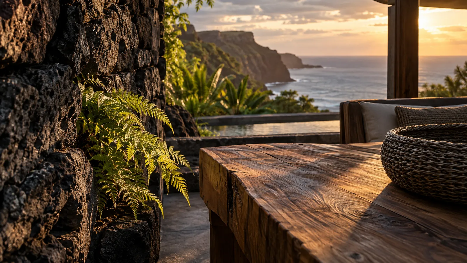
Sense of place lives in specifics: the actual materials of the building, the color of the soil after rain, the sound of a particular stretch of coast, the plants that grow on your land, the way light enters a room at four in the afternoon, the food your kitchen makes from what's grown nearby.
These details belong to you, not to every business in your region. They're also far more beautiful than stock tropical imagery, because they're real.
Culture is not decoration
This matters especially in places with living Indigenous cultures, like Hawaiʻi. Native Hawaiian language, imagery, patterns, and practices carry meaning and history. Using them as ornament, like a decorative Hawaiian word on a cocktail menu or a sacred symbol as a background pattern, can feel careless at best and disrespectful at worst.
When culture is genuinely part of a business, the approach should be to understand it, credit it, and involve the people it belongs to: spelling place names correctly with their diacritical marks, explaining the meaning of names, working with cultural practitioners when telling those stories, and being honest about the land's history. The same principle applies anywhere a business operates on land with deep cultural roots.
Respect isn't a constraint on good design. It's what makes the story believable.
Let the place change the design, not just the photos
A strong sense of place can shape the whole experience: a color palette taken from your actual landscape, typography that reflects the architecture, pacing that matches the rhythm of the place, and motion that echoes something real, like water, wind, or shifting light. A slow, quiet site for a remote retreat; a vivid, energetic one for a lively city restaurant. The site should feel like it could only belong to one place.
Write like someone who lives there
Copy reveals whether a business knows its place. "Tropical paradise" could be anywhere. "Our lanai faces the trade winds, so even August afternoons stay cool" could only be you. Specific, lived-in language reads as authentic, and it naturally avoids clichés because clichés are always general.
The Evermore view
We work from Hawaiʻi, where we see both the beauty of this place and how often it's reduced to a postcard. That's shaped a conviction we bring to destination brands everywhere: the most compelling way to express a place is to look closer, not to repeat what everyone already associates with it.
Your location is the backdrop. Your specific place within it is the story.
If your website feels more like a postcard than a place, tell us about it.