Some of the hardest websites to improve aren't bad. They're fine. Clean, responsive, professional. The photography is decent, the typography is tasteful, nothing is broken. And yet the site feels strangely interchangeable.
That's often a bigger problem than an outdated website, because generic competence is easy to overlook.
The internet has become very good at "nice"
Templates are better, design systems are better, photography is easier to source, website builders are more capable, and AI can produce attractive layouts in minutes. As the baseline rises, polish alone stops creating distinction. A business can have a modern website and still look like twenty competitors.
The question is no longer "Does this look professional?" It's "Could this experience belong to anyone else?"
Generic websites usually begin with generic positioning
If the strategy says luxury, quality, personalized service, unforgettable experiences, and attention to detail, the design has very little to work with. Those ideas aren't wrong. They're just shared by almost everyone in the category.
Distinctive design starts with distinctive truth. What does this business do differently? What do customers remember? What would disappear if a competitor replaced it? What does the place feel like at a particular hour? What does the owner care about enough to do differently? Design can't manufacture authenticity forever. It needs something real to amplify.
Generic sites give everything equal importance
Hero, three cards, image left and text right, testimonials, gallery, call to action, footer. A perfectly respectable structure feels anonymous when the composition never expresses a point of view.
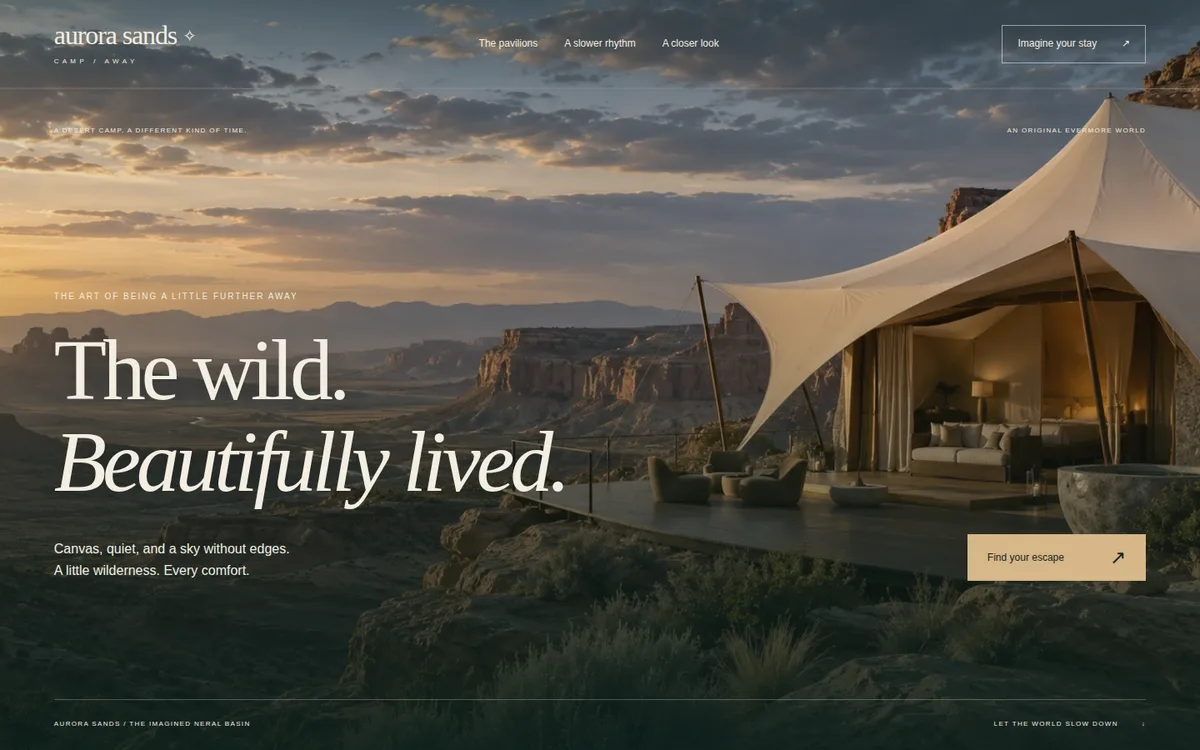
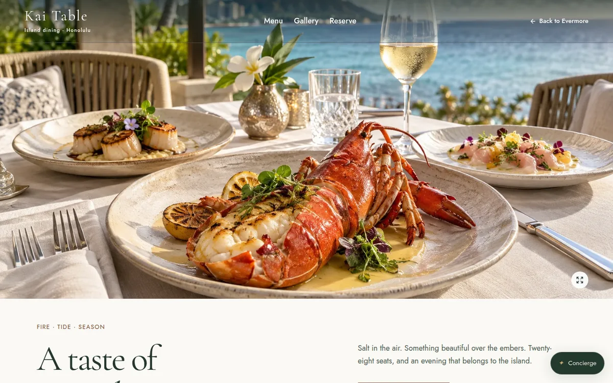
Maybe the property's landscape deserves to dominate. Maybe the food program should interrupt the page dramatically. Maybe room discovery should feel unusually tactile, or the venue's ceremony spaces should become the visual spine of the site. Specific businesses deserve specific hierarchies.
Generic copy is expensive
"Escape the everyday." "Where memories are made." "Experience luxury." "Your perfect getaway." These lines sound polished because we've read them thousands of times, which is exactly the problem.
Specific language creates specific pictures in the reader's mind. A website doesn't need poetic copy everywhere. It needs language that couldn't have been written before someone understood the business.
Generic motion is still generic
Animation doesn't create originality. A template with parallax is still a template. Interaction should reveal something about the content: moving through rooms spatially, a page whose atmosphere shifts with the seasons, a venue that lets couples see how the ceremony spaces connect, a menu that becomes part of the story. It should make sense because of the business, not because it was available in a component library.
Generic websites often ignore the customer's decision
Some sites look lovely but don't answer what the buyer needs. A venue has a gorgeous site while couples can't tell the packages apart. A hotel has cinematic imagery while the room types stay confusing. A retreat feels peaceful while dates, inclusions, and the program are hard to find.
Distinctive design isn't only visual. It's also how the experience makes complicated decisions feel simple.
The Evermore view
The opposite of generic isn't louder. It's more specific: more specific imagery, hierarchy, language, customer journeys, and decisions about what deserves attention.
Your website doesn't need to look unlike every website ever made. It needs to feel unmistakably connected to your business. That's a much higher standard than "looks good," and for remarkable businesses, it's worth pursuing.
If your site looks fine but doesn't feel like you, tell us about it.