
In a small place, many people find their therapist, lawyer, or advisor through someone they know. Hawaiʻi is a good example: on an island, referrals travel fast, and reputation is everything. But the same pattern holds for professional practices anywhere.
Here's what happens next. Someone gets your name from a friend, a doctor, or a colleague, and before they call, they look you up. Your website has one job in that moment: confirm that the referral was right.
People arrive anxious, not shopping
Someone looking for a therapist may be struggling. Someone looking for an attorney may be facing a difficult situation. They're not browsing for fun. They're looking for signs they can trust you with something personal.
That changes the design priorities. Calm beats clever. Plain language beats jargon. Warmth beats corporate polish. The website should feel like a deep breath, not a sales pitch.
Say clearly who you help and how
Vague language like "comprehensive services for all your needs" makes a practice harder to choose. People want to know quickly whether you help with their situation: anxiety or grief, couples or families, wills and trusts or business disputes. Being specific doesn't shrink your audience. It helps the right people recognize themselves.
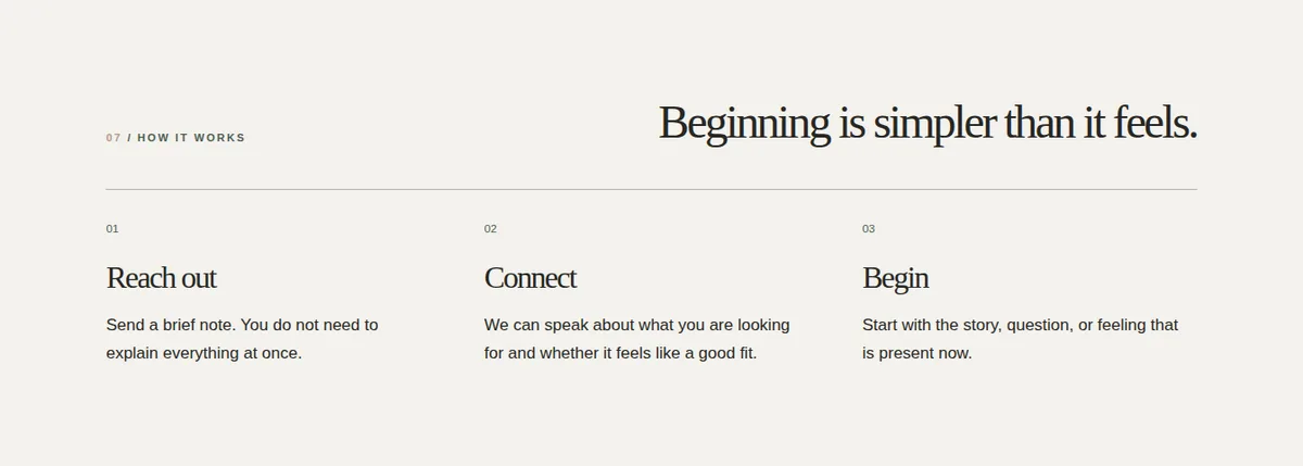
Explain what the first meeting looks like
The unknown is often what stops people from calling. What happens on the first call? How long is the first session or consultation? Is it in person or by video? Does it cost anything? What should I bring?
A short, plain explanation of the first step removes one of the biggest barriers to reaching out.
Be transparent about fees
Not every practice publishes exact fees, but clear information builds trust: typical session or consultation costs, payment options, and how insurance or billing works. When fees are hidden entirely, many people assume the worst and never ask.
Introduce the person, not just the credentials
Credentials matter, and they should be easy to find. But people choose a therapist or attorney they feel comfortable with. A warm, real photograph, a short note in the professional's own voice about how they work, and a sense of their approach do more than a list of degrees alone.
Respect privacy and professional rules
Professional practices carry responsibilities other businesses don't. Contact forms should warn people not to share sensitive details. Many professions have rules about advertising, testimonials, and how services are described, and those rules vary by profession and location, so check yours before adding reviews or claims. For mental health practices, a visible crisis line, such as 988 in the United States, belongs on the site.
These aren't legal fine print to bury. Handled gracefully, they're signals of care.
Make contact easy and calm
A short, gentle contact form, a clear phone number or email, and a straightforward way to book a first call. Avoid long intake questionnaires before someone has even spoken to you; those can wait until after the first conversation.
The Evermore view
For professional practices, the website isn't really there to persuade strangers. It's there to reassure people who already have a reason to call, and to make that call feel easier.
A good practice website feels like the first few minutes of a good appointment: calm, clear, and kind. That's what turns a referral into a relationship.
If your practice is trusted in person but your website doesn't show it, tell us about your work.