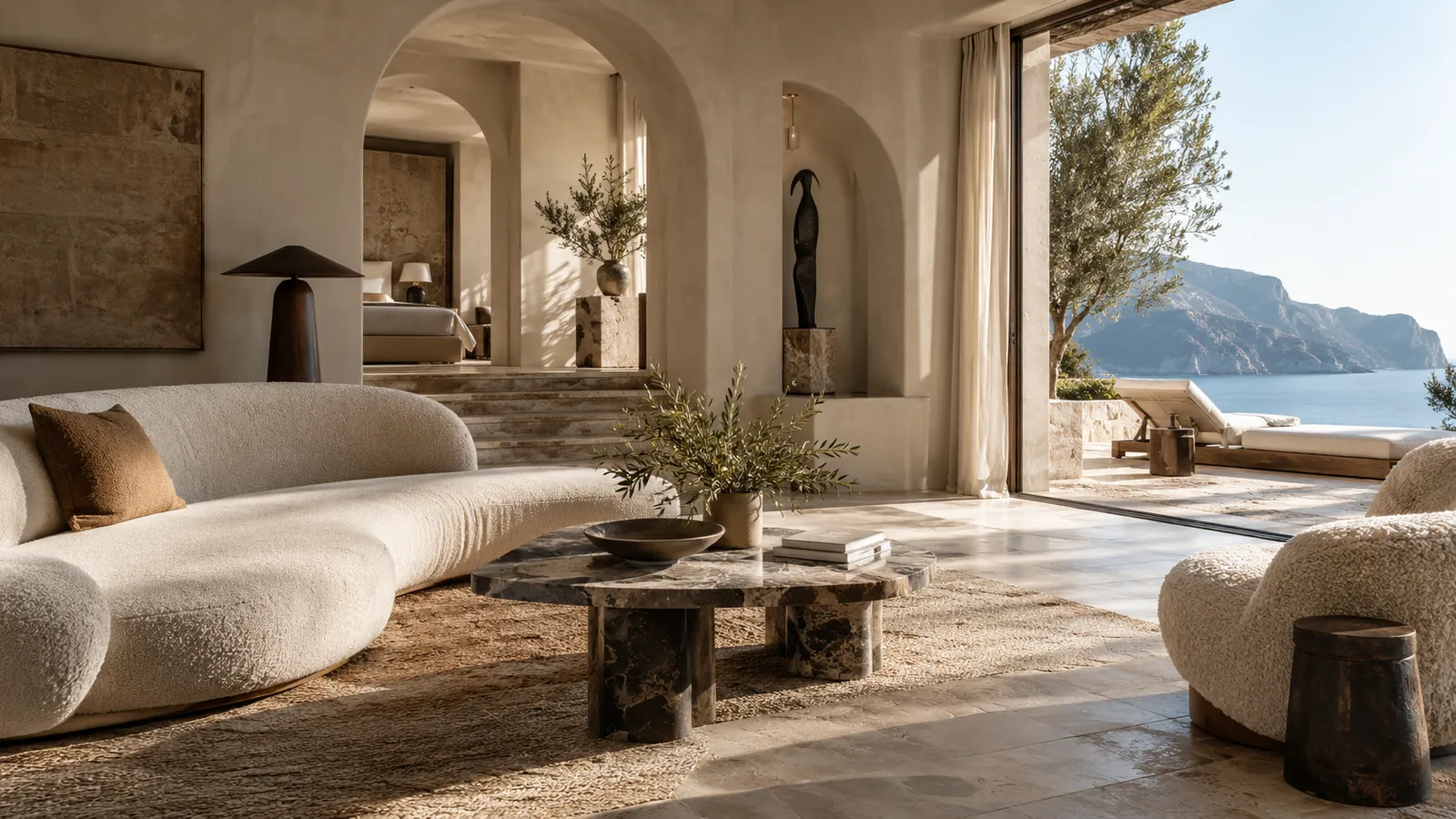
A website can look expensive without looking decorated, and that distinction matters.
"Luxury" web design has developed its own clichés: cream backgrounds, thin serif fonts, gold accents, slow fades, enormous empty spaces, cinematic stock photography, one-word navigation. Used well, any of them can work. Used automatically, they create something worse than ordinary: generic luxury.
The most convincing boutique hotel websites feel premium because they're intentional, not because they contain the recognizable ingredients.
Restraint is not emptiness
Space is useful when it creates hierarchy. It gives important elements room to breathe, slows the pace, and makes typography and imagery feel deliberate. But blank space isn't sophisticated by itself. When a page has little to say, vast beige sections feel unfinished rather than luxurious.
Restraint means removing what doesn't matter while strengthening what does.
Typography should have character without becoming a costume
Typography establishes a brand faster than almost anything else, but a dramatic typeface should support the property rather than perform elegance on its behalf. A historic inn and a contemporary desert hotel shouldn't both reach for the same editorial serif just because both are "premium."
Good typography reflects the personality of the place, whether that's architectural, romantic, coastal, historic, playful, or quiet. The right choice often feels obvious once you see it, even though it was anything but obvious to make.
Photography should feel curated, not abundant
Premium presentation is rarely about showing more images. It's about choosing the right ones. One extraordinary photograph can carry more weight than a twelve-image carousel.
Sequence matters too: a wide landscape, then a detail, then the room, then human scale, then food, then atmosphere. That rhythm makes a property feel dimensional. A giant uncurated gallery flattens everything into visual noise.
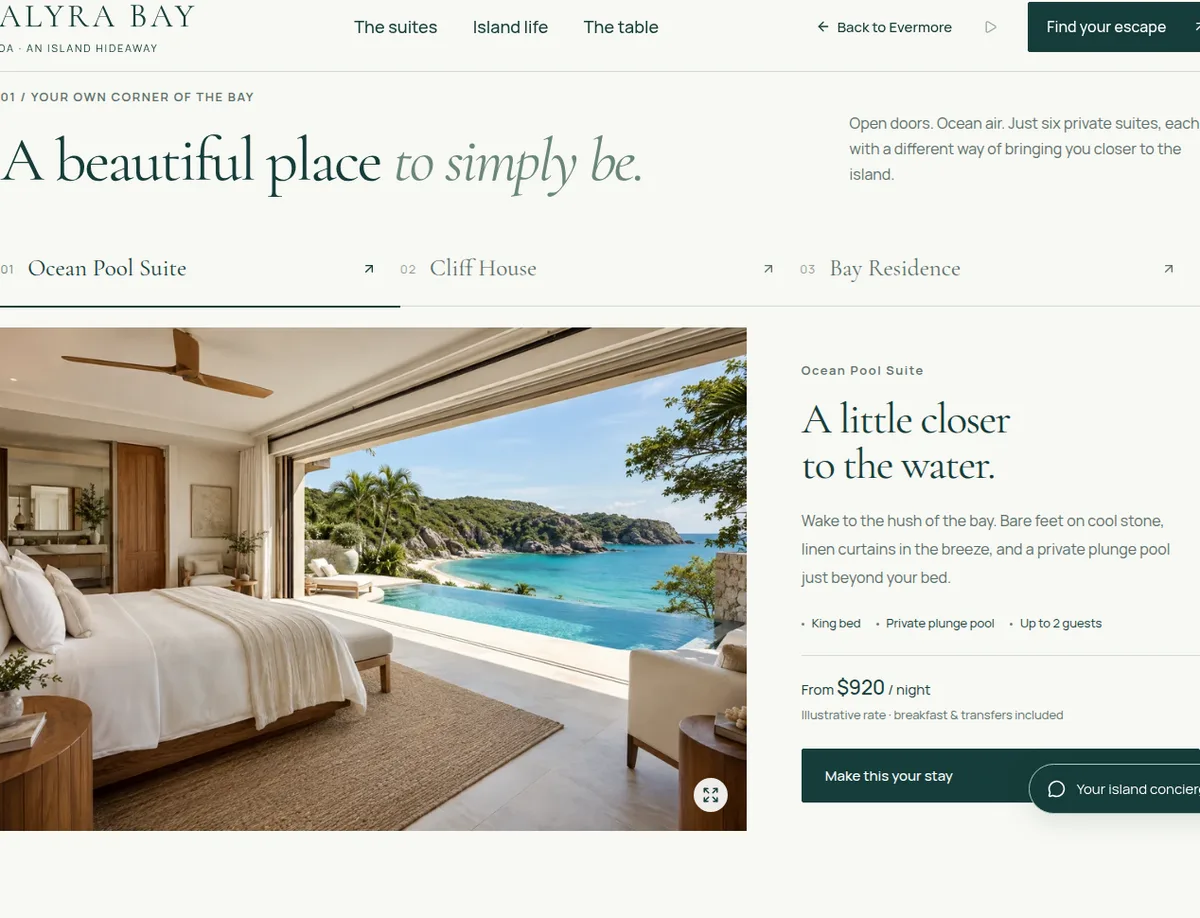
Motion should feel expensive too
Expensive-feeling motion is usually subtle. It has weight, timing, and purpose. A transition lingers just long enough to make the page feel composed; an image reveal responds to the story; a hover shows useful information instead of making something wobble. Too much motion turns the site into a demo reel. Guests should remember the hotel, not the animation library.
Specificity is one of the strongest luxury signals
Premium guests don't want more adjectives. They want confidence. Compare:
An unforgettable escape unlike any other.
with:
Twelve rooms above a quiet cove, breakfast under the citrus trees, and the beach five minutes down the path.
The second line has a world inside it. Specificity builds desire because it gives the imagination something real to hold.
Navigation should feel effortless
A beautiful site loses its sense of quality the moment visitors can't find what they need. Premium doesn't mean mysterious. Rooms, dining, experiences, location, book: labels can be elegant, but they should stay understandable. The best hospitality navigation feels simple because the hard organizing work has already been done.
Know when to become practical
Atmosphere matters, and so do check-in details, room differences, cancellation policies, accessibility, location, and booking. A premium experience doesn't hide practical information. It makes practical information feel considered.
The Evermore view
Luxury isn't more decoration. It's fewer things competing for attention.
A hospitality website feels expensive when every choice looks intentional: what's shown, what's left out, what comes first, how long something stays on screen, how the words sound, how the photographs move together, and how easy the next step feels. The goal isn't to make a website look luxurious. It's to make the business feel unmistakably itself, and beautifully resolved.
If your property is premium in person but generic online, tell us about it.