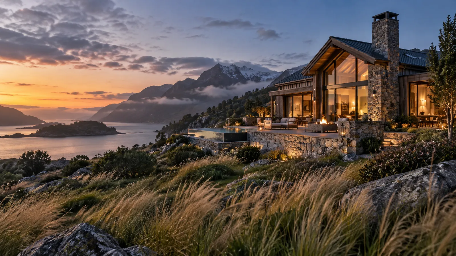
A remarkable place can become strangely ordinary the moment it reaches a screen.
It's a familiar design problem for hospitality, venues, retreats, restaurants, and experience-led brands. The real business has atmosphere, texture, and a point of view. Guests arrive and understand immediately why it's special. Then they visit the website. The photography is there, the rooms are listed, the amenities are explained, and there's a booking button in the header. Yet the feeling is gone.
The website often isn't "bad." Many are perfectly functional. The deeper problem is that the digital experience doesn't carry enough of the real experience with it.
A website can show a place without making anyone want to be there
There's a difference between information and desire.
A visitor can learn that a hotel has twelve rooms, breakfast included, and check-in at three without ever feeling a reason to choose it. A couple can see every ceremony space at a venue without imagining their own day there. A retreat can list yoga, massage, and seasonal meals without communicating the quiet and the reset that make it worth traveling for.
That gap matters because customers rarely compare businesses like spreadsheets. They compare impressions. When several options have similar amenities, location, or pricing, the one that communicates its distinctiveness most clearly often feels easiest to choose. Your website is part of that decision.
The first screen should establish the emotional truth of the business
The opening of a hospitality website has an unusual job. It will answer practical questions eventually, but its first task is simpler: what kind of place is this?
Not every site needs a full-screen video or dramatic copy. But the combination of image, typography, composition, pacing, and language should establish a specific world. A coastal inn shouldn't feel interchangeable with an urban hotel. A desert retreat shouldn't look like a generic wellness template. A wedding venue shouldn't communicate only "elegance" if its true appeal is intimacy, gardens, or an extraordinary landscape.
Specificity is what makes a digital experience memorable.
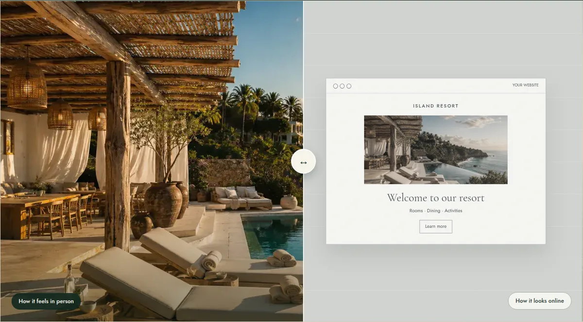
Beautiful photography is not enough
Great photography helps enormously, but photographs don't create hierarchy on their own. A site can hold exceptional images and still feel weak when every image carries equal weight, the strongest photograph appears too late, text competes with the imagery, mobile crops destroy the composition, the sequence has no rhythm, or the call to action arrives before any desire has been built.
The goal isn't to display assets. It's to direct attention, so a visitor knows what to notice first, what to understand next, and what to do when they're ready.
The strongest websites translate experience, not inventory
Think about what makes the business compelling in person. Perhaps it's the way morning light enters the dining room, or that guests walk straight from their suite to the beach. Perhaps the venue's strongest moment isn't the ballroom but the path to the ceremony garden. Perhaps the restaurant changes character after sunset.
Those aren't decorative details. They're part of the product. A strong website finds those moments and gives them enough space to matter, turning a list of features into a sequence of reasons to care.
Mobile is often where the feeling disappears
A desktop composition can look beautiful while the phone version becomes cropped headlines, huge text blocks, images that lose their subject, and booking buried several screens down. That's dangerous, because the phone is usually the first encounter. Someone discovers a property on Instagram or in a travel article and taps through on the spot. For many customers, the mobile site isn't the secondary version. It's the arrival.
A better website doesn't mean adding more
Premium presentation is often about subtraction: fewer competing messages, fewer generic adjectives, fewer calls to action fighting for attention, fewer sections that exist only because every website has one.
Luxury isn't a gold serif font, a beige background, and a slow fade. It's clarity, intention, pacing, and confidence: the sense that every element belongs where it is.
Ask one simple question
Open your website on your phone and look at the first two screens. Don't ask whether it looks professional. Ask:
Does this feel as compelling as the actual business?
If the answer is no, the issue may not be branding, photography, or technology on their own. It may be the way the whole experience is being translated. That's where a thoughtful redesign creates the most value: not by making the site trendier, but by making the digital experience finally worthy of the real one.
The Evermore view
We believe remarkable places shouldn't become ordinary when they reach a screen. The strongest digital experiences preserve what people already love about a business, then make that feeling easier to understand, easier to trust, and easier to act on.
Your business already has the experience. Your website should make people want it.
Tell us about your place.