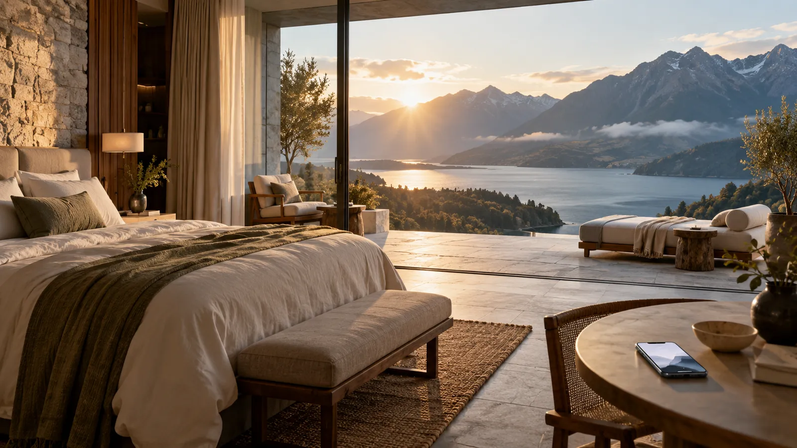
A hospitality website doesn't have to look broken to make booking harder. Some of the most expensive problems are subtle. The site is attractive, the booking engine works, every room has its own page, and yet the guest still has to work too hard.
For hotels, inns, retreats, and glamping properties, direct booking begins long before anyone enters dates. It begins with understanding, then trust, then desire. Here are seven signs a website may be weakening that journey.
1. Guests can't understand the stay quickly
A visitor shouldn't need five minutes to work out what kind of property this is. A boutique hotel? Private villas? A farm stay, a luxury camp, a wellness retreat with lodging, a historic inn? The first screens should establish the offer clearly enough that people can orient themselves immediately. A site that's atmospheric but vague creates intrigue without comprehension. Good hospitality design needs both.
2. The rooms are presented like inventory
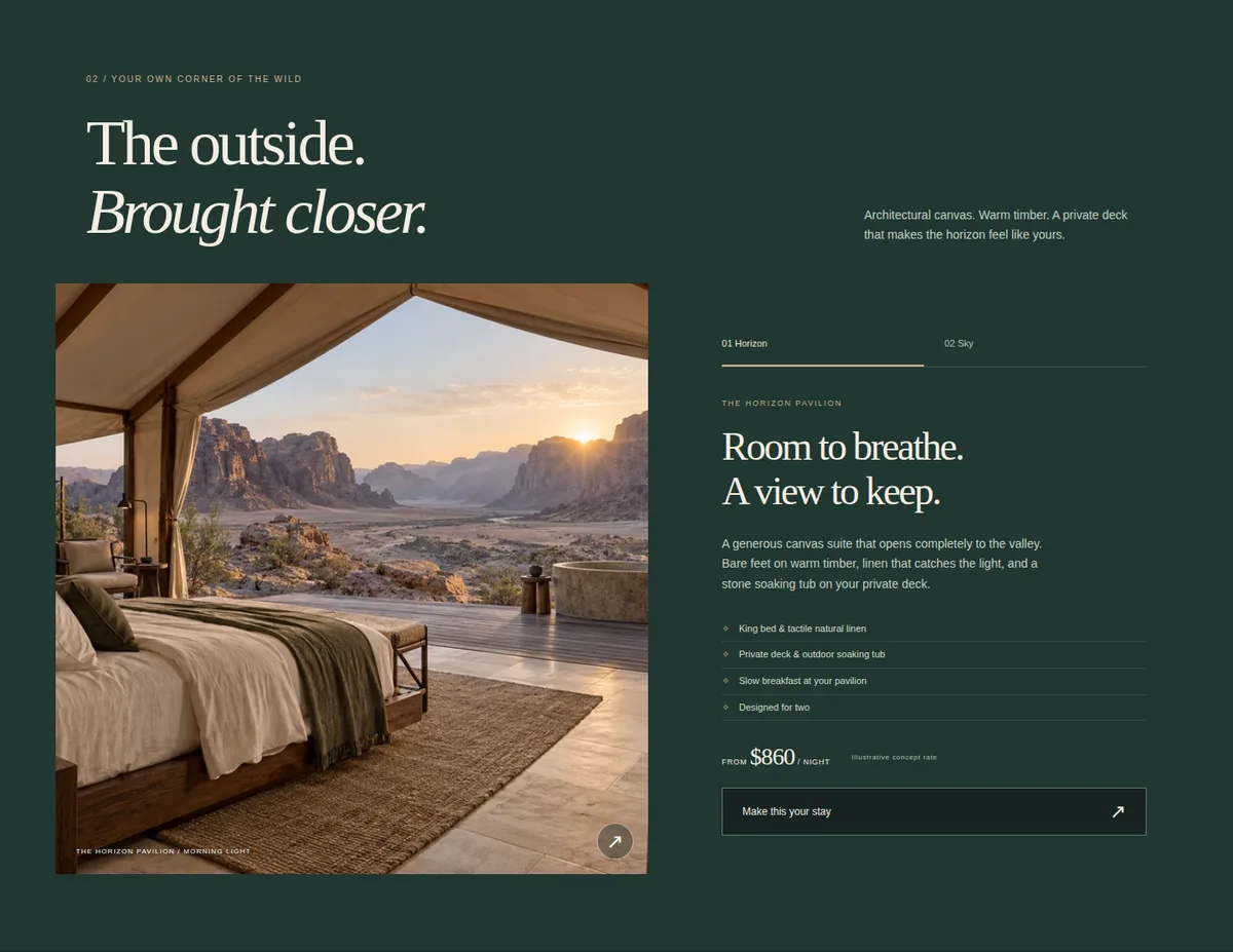
Square footage, bed type, and occupancy are useful, but rarely enough. The guest is really asking: which version of this experience is for me? Which room is quieter, has the best view, feels most romantic, suits a family, or sits closest to the beach or the garden?
Room presentation should support a decision, not merely display stock. (We go deeper on this in our perspective on boutique hotel room pages.)
3. The booking path appears before the desire
A booking button should be easy to find. But a site that behaves like nothing more than a reservation funnel becomes strangely unpersuasive. If the opening pushes dates and availability before the visitor understands the property, it's asking for a decision before earning it. The best booking journeys keep the action available without letting it interrupt the experience.
4. Mobile turns the site into a long stack of content
Many hospitality sites are designed beautifully for desktop and merely rearranged for phones: oversized headings, badly cropped images, buried room links, awkward carousels, and sticky booking bars that cover the very content guests are trying to read. Mobile needs its own composition. The hierarchy can stay consistent, but the experience should be rebuilt intentionally for a thumb.
5. The strongest reason to choose you is buried
Every memorable property has something that matters disproportionately: the location, the privacy, the architecture, the food, access to a particular landscape, or a feeling guests mention again and again. If that advantage sits halfway down the homepage, diluted among fifteen other selling points, the site is treating its strongest asset like just another feature. Make it hard to miss.
6. Booking platforms explain your property more clearly than your own site
This is one of the clearest warning signs. Open your website, then open your listing on a major booking platform. Which makes it easier to understand the rooms, amenities, location, availability, policies, and next steps?
Your own site shouldn't lose to a marketplace at explaining your own property. It has an advantage the marketplace never will: it can communicate the full identity of the business. If the marketplace is clearer and your site is merely prettier, something is missing.
7. The booking engine feels like another company
A beautiful website ends abruptly when someone clicks "Book." The colors change, the typography changes, navigation disappears, and the interface turns dense. The guest suddenly feels sent somewhere else.
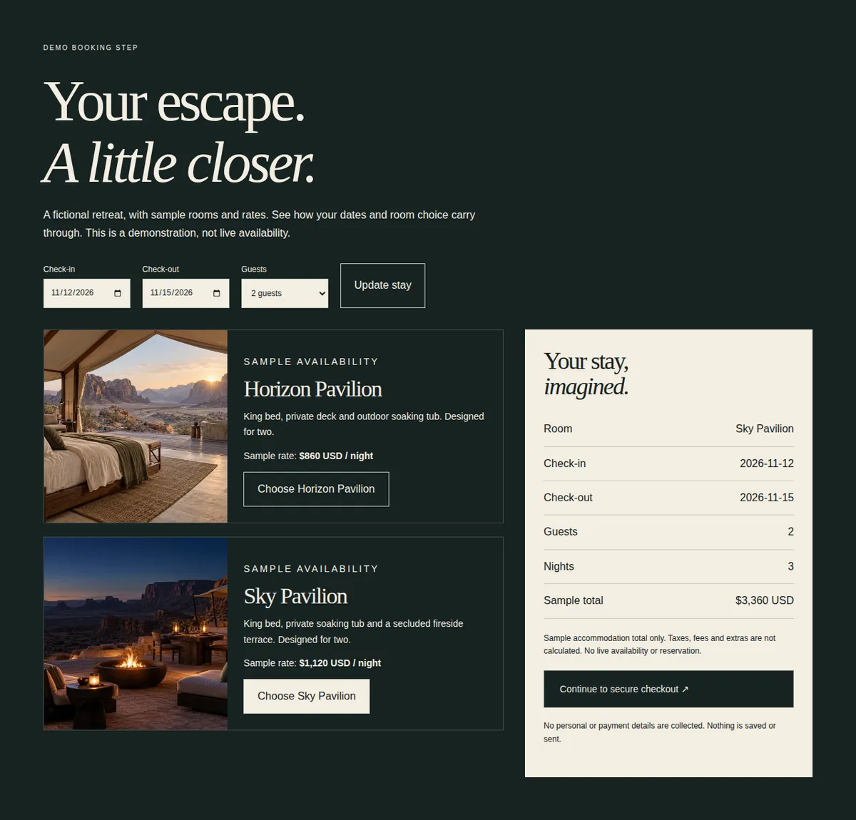
Booking providers can't always be fully customized, and that's normal. But the transition can still be prepared thoughtfully: explain what happens next, carry the look as far as the provider allows, and minimize surprise.
Direct booking is a journey
The question isn't "Is the booking button visible?" It's "Does the whole experience make guests steadily more comfortable choosing us directly?" That journey runs from emotional arrival through understanding the property, discovering rooms, building trust, checking practical details, exploring rates, and finally the handoff to booking. Each stage should make the next one feel natural.
The Evermore view
A hospitality website shouldn't behave like a brochure with a booking button attached. It should carry someone from that looks beautiful, to I understand why this place is different, to I can imagine myself there, to I know what to book, and finally to let's go.
That's where design becomes part of the customer journey rather than decoration around it.
If your property is stronger than its current booking experience, tell us about it.